Interior design sounds polished until you are standing in a 1994 kitchen with almond cabinets, three competing light bulbs, and a refrigerator door that hits the pantry. For our Salt Lake City renovation, interior design was not about creating a perfect photograph. It was about making a 180-square-foot room work better for two adults, two kids, weekday breakfasts, and the occasional pan of homemade pizza.
I approached the project like a product launch because that is the language my brain understands. We wrote down problems, ranked them, tested inexpensive ideas, and tracked every dollar in a Google Sheet. Megan was better at noticing how a room felt; I was better at measuring cabinet clearances. Both skills mattered. The most attractive plan on paper would still fail if we could not unload the dishwasher without blocking the only walkway.
What Interior Design Meant in Our Kitchen
Our first mistake was treating interior design as a color problem. We spent an evening comparing white paint samples while ignoring the fact that the main work triangle was awkward. The sink sat too far from the range, the microwave occupied valuable counter space, and the old peninsula made the room feel narrower than it really was.
We listed the problems in plain language. The kitchen needed better task lighting, more landing space beside the range, a place for lunch containers, and storage that our children could reach without climbing onto a chair. Those requirements shaped the design more than a trend board did. We kept the existing plumbing location, moved the microwave into a lower cabinet, and replaced the peninsula with a shorter island.
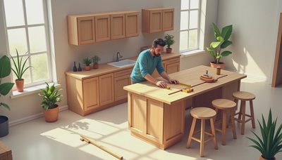
The island was the most important layout decision. Our first drawing showed a 39-inch-wide island, but a cardboard mock-up made the aisle feel cramped. We reduced it to thirty-six inches wide and gained enough clearance for the oven door. That three-inch change cost us some drawer space but improved daily movement. Measure twice, cook once became less of a slogan and more of a survival technique.

Where Our Kitchen Budget Actually Went
Our original working budget was $22,000. The final total came to $24,680 after sales tax, a replacement shutoff valve, and an electrical change we did not discover until demolition. That number included cabinet fronts, butcher block, tile, lighting, paint, hardware, permits, tools, and a modest labor allowance for work we were not qualified to do ourselves.
The cabinet portion was about $8,400. We used semi-custom boxes from a regional supplier rather than fully custom cabinetry, then spent extra on deep drawers near the range. The drawers were not the cheapest option, but they are easier to use than stacked lower cabinets. A $700 lighting package included four recessed LED fixtures, two pendants, and under-cabinet strips. The electrical work added another $1,150.
We saved money by keeping the sink and dishwasher near their original locations, installing the backsplash ourselves, and painting instead of replacing the drywall. We did not save money by buying the cheapest faucet. A $140 faucet looked attractive online, but its spray switch felt flimsy in the store. We bought a Delta model for $285 instead. That was not a glamorous upgrade; it was simply one less part I expected to replace in two years.
The spreadsheet also exposed small costs that are easy to ignore. We spent $186 on blades, spacers, drop cloths, and extra drill bits. Delivery fees totaled $420. Temporary meals and coffee during the six-week disruption came to roughly $310. Those expenses did not improve the room, but they absolutely belonged in the renovation budget.
Choosing Materials Without Chasing Trends
Our interior design goal was a warm, durable kitchen that would still look reasonable when the next trend arrived. We chose flat-panel cabinets in a muted blue-gray, natural maple open shelving, white quartz counters, and small matte ceramic tile. The palette was intentionally boring in the best possible way. Hardware and paint can change later; counters and cabinets are much harder to rethink.
I brought home sample boards instead of trusting tiny showroom chips. The blue-gray cabinet color looked calm under the store’s bright lighting but read almost charcoal under our old warm bulbs. We tested it beside the floor, trim, and stainless appliances at three different times of day. In the evening, the first color made the room feel heavy, so we selected a lighter version.
The quartz decision involved more practical testing. We placed coffee, tomato sauce, and a wet dish towel on sample pieces and left them overnight. This was not a laboratory test, but it showed how the surfaces looked in the conditions we actually live with. We also checked seam placement before ordering. The fabricator’s first drawing put a seam directly beside the sink, where it would have been highly visible.

The Mistakes I Would Avoid Next Time
The biggest mistake was ordering pendant lights before confirming the island location. When the island became narrower, the original fixtures looked too large and hung closer together than planned. Returning them cost a restocking fee and delayed installation by a week. The replacements were smaller, simpler, and about $90 less expensive as a pair.
I also underestimated ventilation. We assumed the existing hood was adequate because it turned on and made noise. During the first serious cooking test, steam collected on the cabinet above the range. We replaced it with a quieter, properly vented model for $780, including duct adjustments. That was money we should have planned from the beginning.
Another lesson involved open shelving. Two shelves looked great in our design, but one became a dumping ground for mail, snack bags, and school notices. We removed it and installed a shallow cabinet instead. The room lost a little visual openness and gained a lot of sanity. Interior design has to survive Tuesday afternoon, not just the day you photograph it.
A Simple Process for Planning Your Own Remodel
Start by documenting the room as it exists. Measure walls, doors, windows, ceiling height, appliance openings, and the distance between work areas. Photograph every wall and mark outlets, plumbing, vents, and switches. I put all of that information in one folder before contacting suppliers.
Next, separate needs from preferences. A safer electrical layout is a need. A brass faucet is a preference. Better task lighting is a need. A specific shade of green is a preference. This distinction makes it easier to protect the budget when a hidden repair appears.
Then create a rough layout with painter’s tape or cardboard. Walk through opening the refrigerator, loading the dishwasher, carrying a hot pan, and standing two people deep at the sink. If the layout fails in cardboard, it will not be rescued by expensive finishes. This inexpensive stage was the most useful part of our interior design process.
Finally, add a contingency line of at least 10 percent for an older kitchen. Ours covered the valve, wiring adjustment, and several small surprises. Keep receipts, record decisions, and revisit the plan after demolition. The kitchen will tell you things the listing photos never did.
What We Would Spend On Again
We would repeat the cabinet drawers, improved lighting, vented hood, and the narrower island. Those changes improved cooking and cleanup every day. We would also choose the same quartz and tile because both have handled spills, homework projects, and hurried breakfasts without demanding special treatment.
We would spend less time debating decorative details before solving the layout. Paint color mattered, but it was not the reason the finished room feels better. The successful interior design choices were the ones that reduced friction: clear landing space, reachable storage, sensible light, and durable surfaces.
Our kitchen is not magazine-perfect. The kids leave water bottles on the counter, one shelf has a chipped bowl, and I still occasionally measure something incorrectly. But the room works, the budget is documented, and dinner no longer requires a game of cabinet Tetris. If you are planning a similar renovation, start with the problems you can feel every day. Measure twice, cook once, and let the pretty decisions follow the practical ones.